

Shakespeare in the Park is one of those New York traditions I'm so happy I was finally able to experience. Thanks to my persistent roomie for waking up before 5am to get in line for 8+ hours! I saw the Merchant of Venice, and while Al Pacino's performance was fantastic, the story was definitely unsettling (read synopsis here if you don't know what I'm talking about).
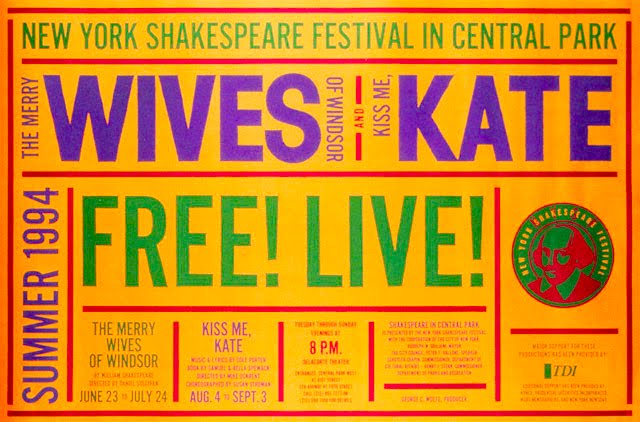
Anyway, every year I look forward to the new poster campaign that will be plastered all over the subway system. For the past 14 years, they have been designed by Paula Scher at Pentagram. She has developed a typographically driven branding system that always manages to make classic Shakespeare work seem fresh and exciting. Below are two from recent seasons...


Here is the original poster from 1994...
And some more from past years...


